app design
ui design
user testing
AR
UI Design for an Educational AR App: New Worlds Reading AR Expeditions
App Design
MY ROLE
UI/UX Designer
What I did
- Main menu and navigation system
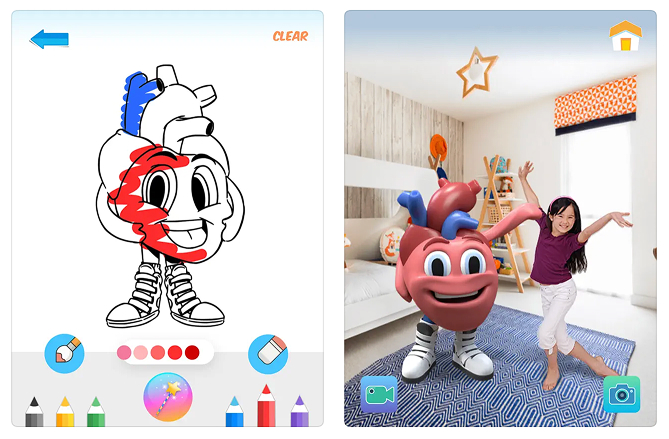
- Aquarium experience flow and edit interface
- Bubble Pop quiz interaction design
- In-game feedback cues and educational prompts
Timeline
3 months, app is launched 2025
Team
3D Artist, AR/VR Developer, Research Team
Overview
Developed by the University of Florida College of Education and Lastinger Center for Learning, the app uses gamified AR experiences to make literacy more accessible and exciting.
The Challenge
How do we design an interface that encourages reading without overwhelming kids who struggle with reading?
The paradox at the heart of AR Expeditions
We're building an app to motivate reluctant readers, but every piece of text on screen is a potential barrier.
The Design Problem
Target users are already frustrated with reading
3rd-5th graders reading below grade level need confidence-building, not more cognitive load.
AR adds complexity
Designing for 3D space requires different UI thinking than traditional apps.
Balancing fun and learning
Kids need to engage with educational content, not skip past it to the "fun parts".
Research & Approach
Understanding the 8-10 year old mindset
My Research Process:
Studied existing AR apps for kids
I analyzed popular AR educational apps and games to understand UI patterns that worked in 3D space.
Key Findings
- Large, clear buttons with high contrast
- Minimal text, maximum visual cues
- Persistent navigation that doesn't get lost in AR space
- Immediate feedback for every action
Understood the literacy challenge
Working with the research team, I learned about the specific barriers reluctant readers face:
Key Findings
- Overwhelming text blocks cause anxiety
- Need for audio support to build confidence
- Importance of success moments to build motivation
Designing the Experience
First Iteration
I started designing the main navigation and Aquarium Experience and making sure the design is simple, understandable and persistent.
But we quickly found out that this might not be ideal.
Students searching for programs required more specific filtering options, such as "degree level" and "program type." Additionally, we needed to highlight the College’s high-ranking online programs due to our strong conversion rates. We realized that without emphasizing online programs, we were missing an important opportunity to attract more prospective students.
This single-level filter could potentially get very long, and will affect the user experience when browsing programs.

During testing, it became clear that the color-coded system wasn’t intuitive for users. The color distinctions weren't obvious enough, leading to confusion and accessibility concerns.
Additionally, the grid layout compressed content, limiting the amount of information we could display about each program.
Additionally, the grid layout compressed content, limiting the amount of information we could display about each program.

Collaboration & Constraints
In response, we implemented a multi-filter system.
Considering our data structure, we want our approach to allow users to filter programs by multiple criteria—such as degree level, delivery format (e.g., online, hybrid, in-person), and area of study—giving students an opportunity to get a more personalized results. The multi-filter system provided flexibility and addressed both the needs of prospective students and those of academic advisors who assist students in selecting or changing majors and minors.
I tried out 2 patterns of filter, including sidebar filter and a filter bar with addictive pills on top.
The side bar filter would not be ideal since our program offerings are shown on a web page, It might seemed confusing since left hand side bar mostly affects the whole page and is fixed-position.


Filter bar, on the other hand, is flexible for web pages. I tried out using tabs to select categories and another filter option to select the program type.


I also thought about batch-filtering instead of live-filtering; however, given the environment of our website we decided that live-filtering would be functional enough.

Due to the complexity of programs and the data structure, we went with the top filter bar with button filters
We've discussed with our end users and found out a button filter would be intuitive to them and leading to a very straight-forward result.

While the Admissions page has reached a solution that meets our academic advisors' and students' needs, I started thinking about scalability and how we manage our data.
Outcome & Reflection
What's the problem with the current workflow?
One of the biggest challenges we faced during this project was the lack of a centralized content management system (CMS) for complex information, such as our program offerings. Without a CMS, managing and updating program details across multiple pages became a disjointed and inefficient process. Information could easily become inconsistent, leading to discrepancies across the website. This inconsistency made it difficult for potential students to find accurate program information and created a frustrating experience for academic advisors trying to guide students through their options.
This is what our current workflow looks like...

My proposed workflow...

We worked with our back-end developer to implement a more scalable solution by storing program data in a JSON file. This approach centralized program information in a single location, allowing for easier updates and reducing the risk of discrepancies. The JSON data could be accessed and displayed dynamically across the site, ensuring consistency and saving time on manual updates.This new system not only improved accuracy but also optimized our internal workflow, making it easier for designers and content managers to handle the growing complexity of our program offerings.
I also tried out building a WordPress plugin
We experimented with various ways to manage this program data more effectively using custom post types within WordPress. This method reduced the risk of redundancy in the workflow, streamlined content management, and improved the overall efficiency of managing large amounts of information.