From Information Overload to Guided Discovery: Simplifying 100+ Program Offerings
App Design
Project
Timeline
What I did
Overview
The University of Florida College of Education needed a more intuitive way for prospective students to explore their 50+ graduate programs. The existing program directory lacked effective filtering and organization which creates frustration and barriers to enrollment.
I redesigned the directory with a multi-filter system that lets students search by degree level, delivery format, and program area. The solution improved both the user experience and backend efficiency through a custom WordPress plugin that simplified content management.
Outcome
+10,695 views and 2x event counts
to the program directory page in the first year after launching (June 2024-June 2025)
The Challenge
With 100+ program offerings buried in poor information architecture, potential students couldn't find what they needed, and advisors couldn't help them navigate the chaos.
1. Potential students struggle to locate the programs that interest them, leading to frustration and confusion. This hampers their ability to make informed decisions about their academic futures.
Understanding the Users
Understanding the Users
The College of Education Admissions page faces a challenge with the disorganized presentation of program offerings, which disrupts the enrollment funnel. Potential students struggle to navigate the page, preventing them from moving forward in the application process, which in turn affects enrollment numbers.

What's wrong with the current admissions page?
2. Information overload: Small text and abbreviations that is confusing to visitors.
3.Lack of filtering options: There's no way for users to easily sort or filter programs based on their interests or requirements. Ideally, we need more identifiers for users to reach their intended results.
How might we create an experience to guide more students toward enrollment, and also improves the quality of academic support for current students?
Exploring Solutions
A couple of more proposal before we reached an ideal solution

But we quickly found out that this might not be ideal.

Additionally, the grid layout compressed content, limiting the amount of information we could display about each program.

The Multi-Filter Solution
In response, we implemented a multi-filter system.
I tried out 2 patterns of filter, including sidebar filter and a filter bar with addictive pills on top.


Due to the complexity of programs and the data structure, we went with the top filter bar with button filters

While the Admissions page has reached a solution that meets our academic advisors' and students' needs, I started thinking about scalability and how we manage our data.
Behind the scenes: Systems Thinking
What's the problem with the current workflow?
This is what our current workflow looks like...

My proposed workflow...

The JSON data could be accessed and displayed dynamically across the site, ensuring consistency and saving time on manual updates.This new system not only improved accuracy but also optimized our internal workflow, making it easier for designers and content managers to handle the growing complexity of our program offerings.
I also tried out building a WordPress plugin

Plugin Demo
It also supports pre-filtering and displaying different templates. Depends on the needs of the college, we could add in new templates to support any use cases.

Before & after
Design Walkthrough
Before
- Poor legibility
- Design is not consistent with our branding
- A line of acronyms without any context
After

- Added chips for category for visitors to quickly scan through this information
- Our academic advisors hope to keep the acronyms, so we added links for them for visitors to get more context when they’re directed to a detailed page
Before

- Potential students need more filters to narrow down the results
- Dropdowns are harder to navigate when users are browsing the page
After
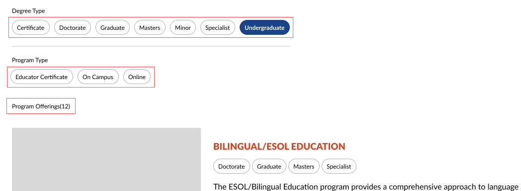
- Multi-level filter types to allow potential students to select programs they have interest in
- Added another filter type, since we are renowned in our online programs and this creates an important funnel for our online program enrollment
- Show student the number of programs that fits the results
Reflection & Impact
Results
The redesigned program directory launched in July 2024 and immediately improved the student experience:
+10,695 views within the first year of launching the new Program Directory
Zero support tickets related to finding program information since launch
Positive feedback from academic advisors who now use it as a primary tool during advising sessions
2x growth on clicks for Program Directory page in the first 3 months after launch
What I Learnd
Sometimes the best solution requires multiple attempts
My initial proposals seemed logical on paper but failed in practice. This taught me the importance of testing early and being willing to kill ideas that don't serve users, even if they're easier to build.
Good design extends beyond the interface
The multi-filter system solved the user-facing problem, but discovering the workflow inefficiency behind the scenes was equally critical. Designing the JSON structure and WordPress plugin wasn't glamorous, but it ensured the solution could scale. This project reinforced that UX design includes the systems that power the experience.