User Stories & Storyboards

I started sketching out user flows and brainstorming how a user would interact with the app before they go to SF MoMA and during the visit.

User Flows

I started sketching out user flows and brainstorming how a user would interact with the app before they go to SF MoMA and during the visit.

Link to detailed User Stories & Storyboards

Overview

Under the pandemic, the government releases the Name-Based Mask Distribution System to prevent people from stockpiling face masks. Citizens can use their National Health Insurance card to purchase masks at local pharmacies.
But the problem shortly occurred after the policy. Local Pharmacies were packed and people have to line up for almost half an hour to purchase masks.
Thus the government issued another solution, citizens can purchase masks from the National Health Insurance Express App. However, users experienced certain pain points while using the App.
This case study aims to better the user experience while ordering masks and looks forward to making the process easier.

Constraints

This is a self-initiated project so I only chose to redesign the flow of ordering masks on order to keep the scope smaller and create an MVP version.

Interviews & Usability Testings

I immediately started interviewing and record users navigate through
the original app to complete tasks.
These are the tasks I asked users to complete during interviews:

Key Takeaways from usability testings

From the insights I gain from usability testings, I made some changes of the tasks flow:

My next step is to do another user testing for the two concepts and one variation I came up with:

Conduct concept testing - I presented two ordering flow concepts.
Uncover user expectations - users were asked how would they expect the order status to be presented on the app.
Test big picture usability flows - observing the tap interactions.

Usability Testing Documentation

Design and Prototypes

Here are the main design changes I've made for the project for now.
(I also included the Chinese version for comparasion)

Simpler Homepage Arrangment

The original homepage presents too many CTAs and is sometimes confusing for users at first glance.

So I redesigned the icons and put some functions that aren't use as frequently into the hamburger menu.

Order User Flow

I use tabs to categorized "Past Orders" and "Place Order", to make the page easier for users to order masks. I designed the "Place Order" page to be the default when starting the "Mask Order" user flow because this function is for now user's main purpose.

Wording Clarification

The original wordings of the order status are misleading for most users, resulting in high error rate when performing task#3 (Look for order numbers for pickup validations). So I adjusted the wording on number of action buttons based on user feedback, in order to clarify the expected action.

Final Prototype

Project Takeaways

1)  Fast iteration promotes design learning
It was incredibly helpful and rewarding to conduct usability testing, hearing from my participants about the problems they encountered and their opinions about my design solutions.

2) No problem is too big or too small
Even though I chose to redesign a single flow in this case I still found a lot of small details that could be improved.
Rather than coming up with the ”best solution” and spending more time perfecting it, exploring more solutions allowed me to consider different concepts and take action on what design would work best in the existing information architecture.

Ideation & Iterations

I was in charge of designing the product browsing pages and user profile pages.
And I'll focus on these for ideation and just show the big decisions we had.

GOAL 1

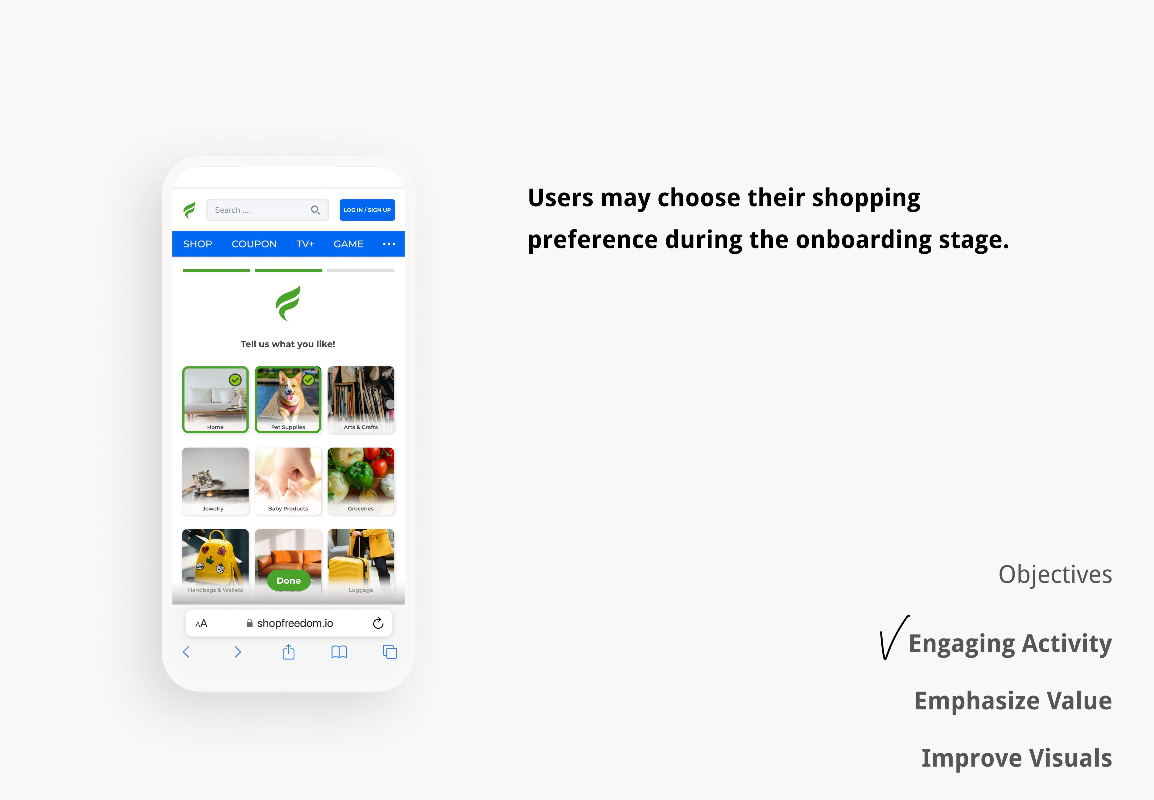
Emphasize on values that resonate with shoppers

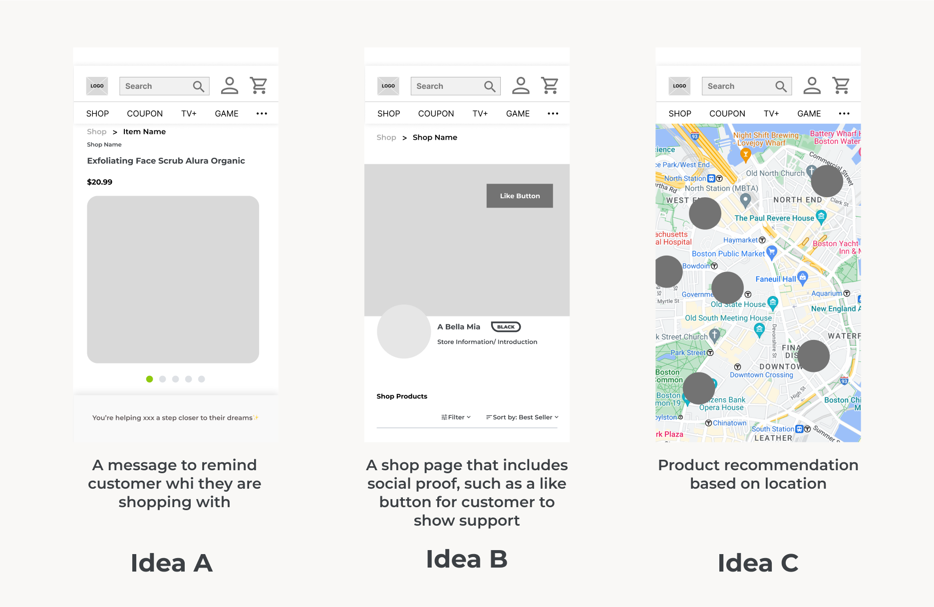
I came up with three concepts about how we can emphasize values during the browsing experience.

  • Idea A is to have a fixed message at the bottom when shopping, reminding customer of who they're shopping with.
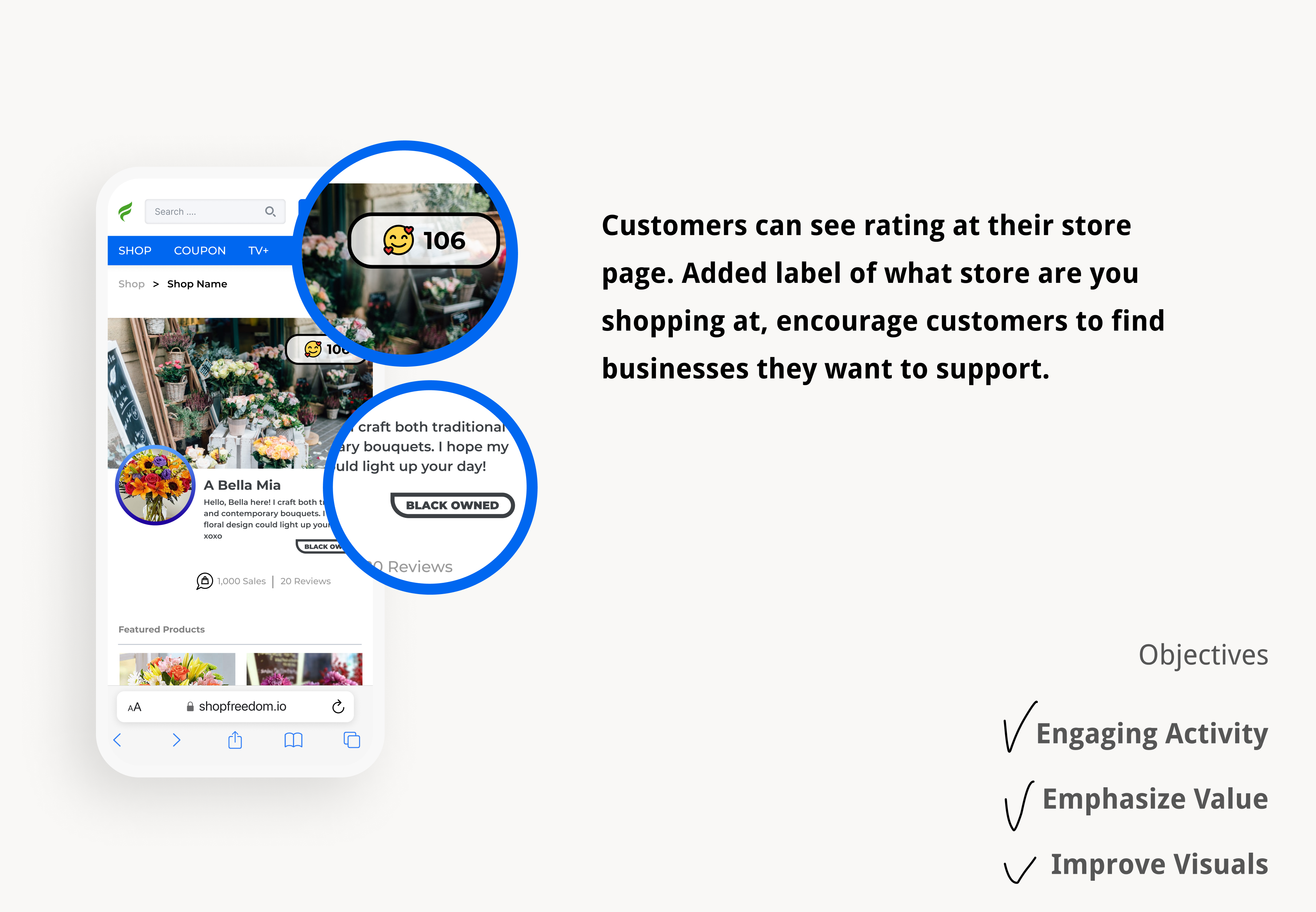
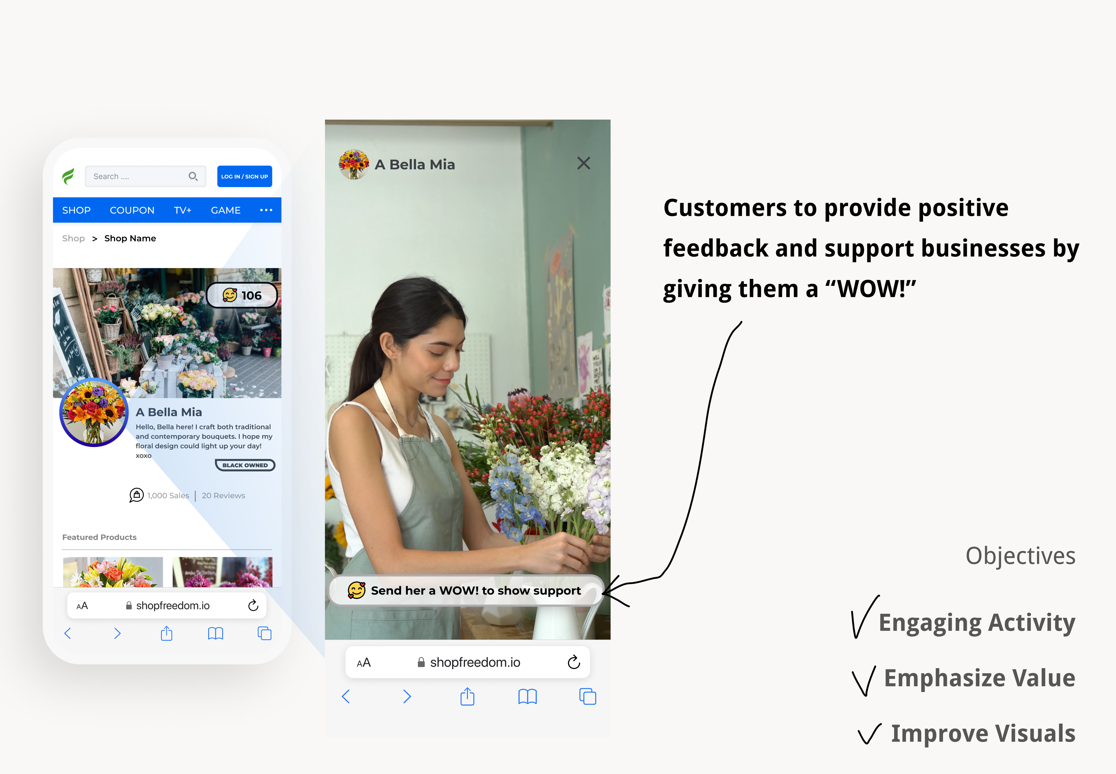
  • Idea B is adding a like or heart button on the shop page, showing that this is a tight-knit community.
  • Idea C is to recommend shops and products based on locations.

After some deliberation, we decided to focus on Idea B. We found that Idea A does not have enough recognition and might be mistaken as an ad. Idea C might be hard to navigate through.

GOAL 2

Provide an engaging environment

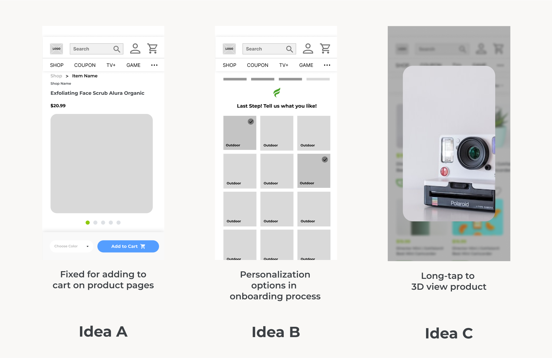
We eliminate Idea C due to technical complexity. Then we decided to try out both Idea A and B!

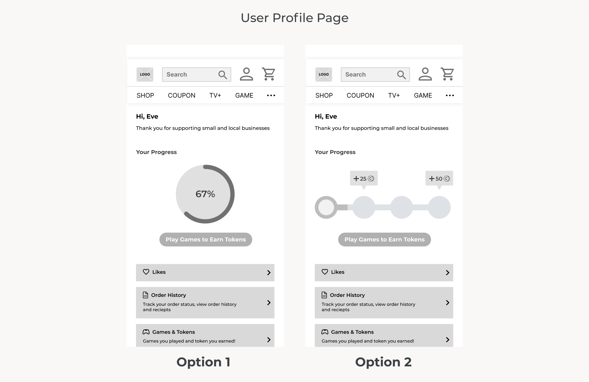
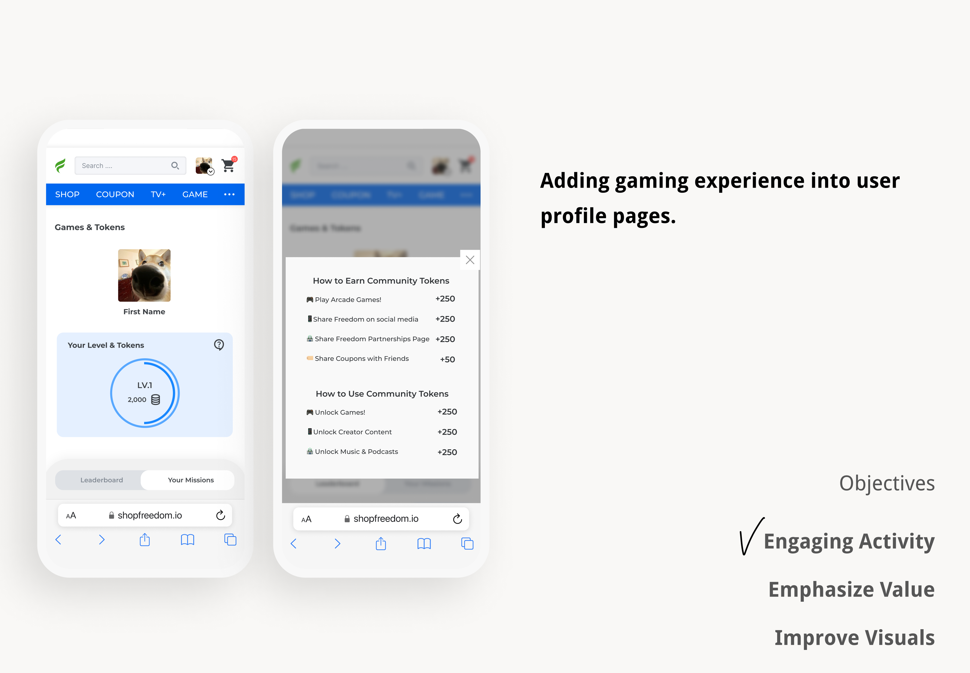
One of our stakeholders wanted to integrate the gaming experience onto the platform. However, this was quite a challenge for me.
For the following reasons:

  • The concept of gamifying shopping experience would be relatively new for most customers
  • This was my first time designing a “gaming profile” on a website
  • This request requires so much clarification I have to schedule meetings and ask different questions in order to move forward

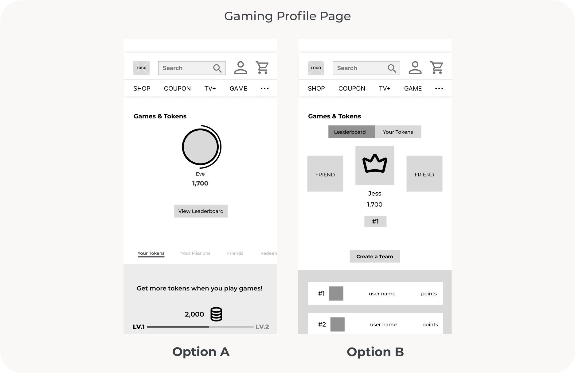
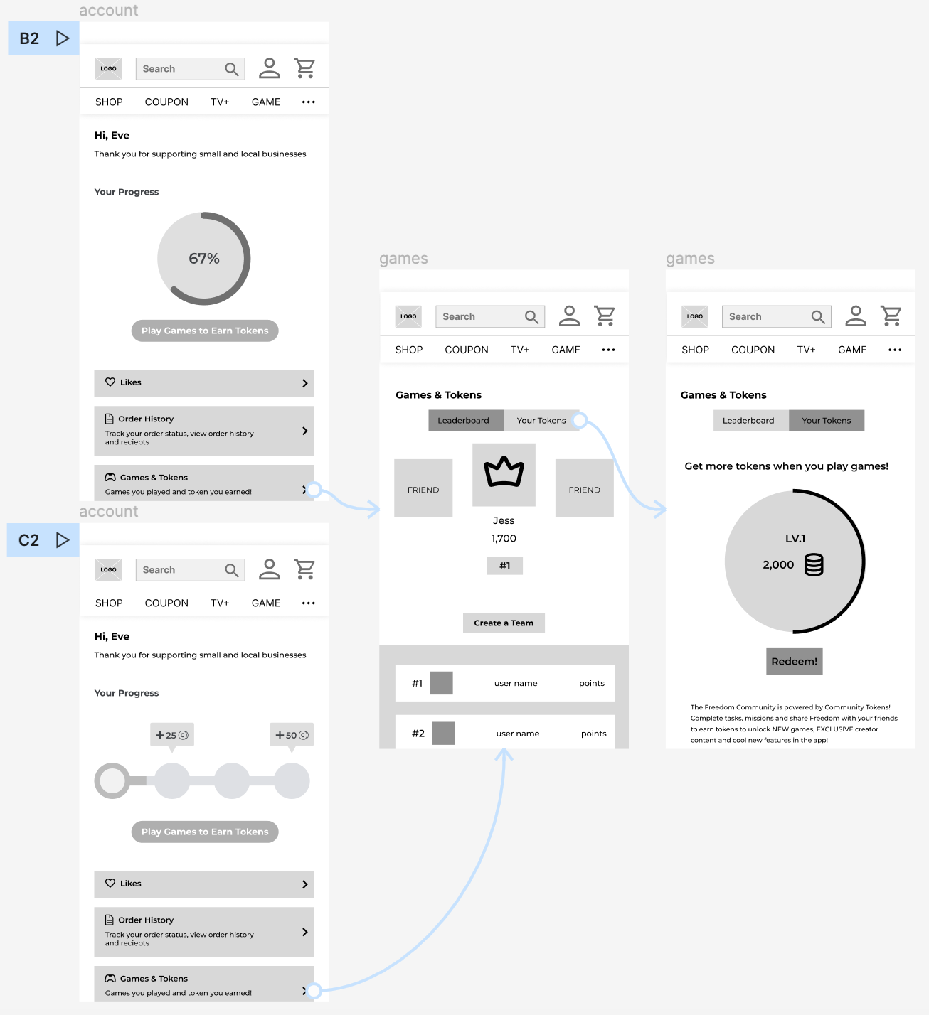
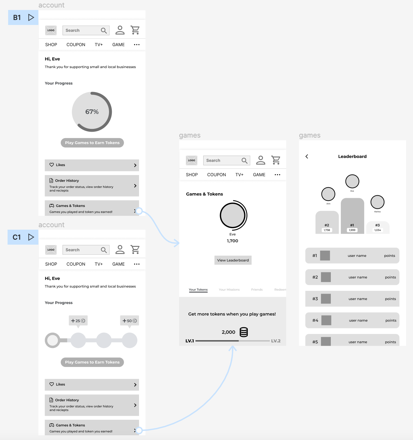
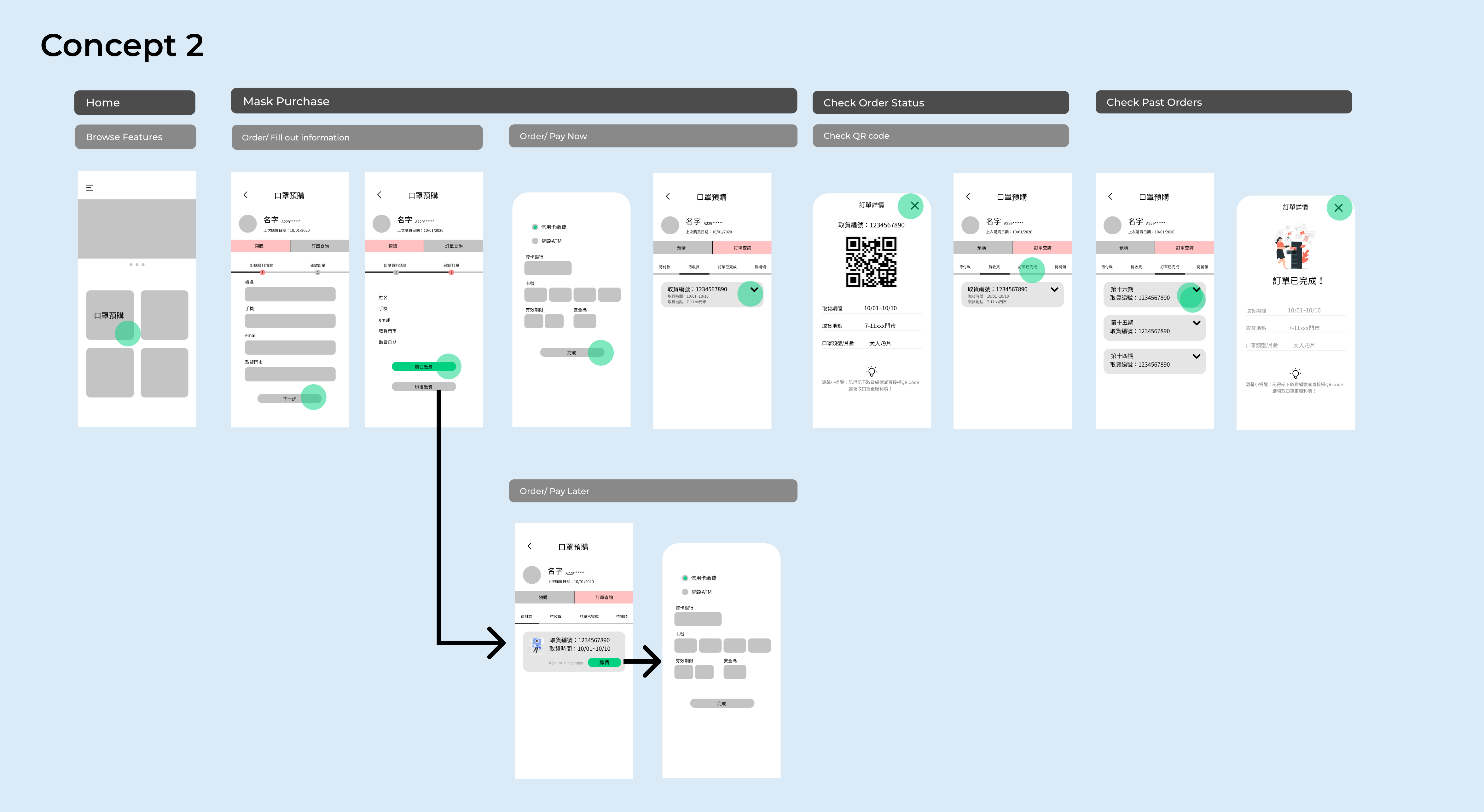
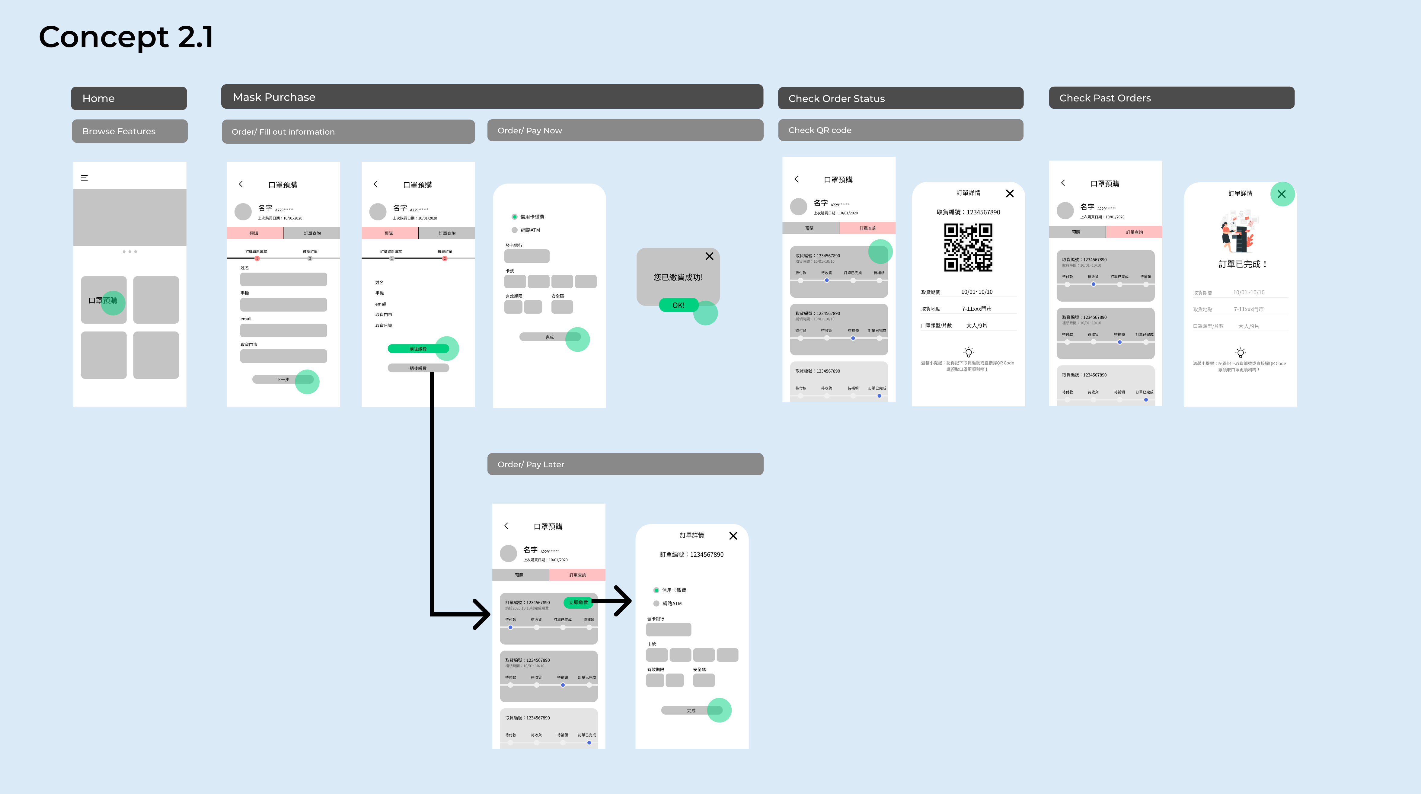
So I brainstormed on how the page could look like and came up with 2 options on user profile and 2 options on gaming profile.
My goal here is to provide a fun and exciting experience with easy wayfinding and no confusion.

Validating Ideas

After discussions, we decide to test these combinations out internally and gather feedback.

Testing Results

I asked users to perform 2 tasks in order to ensure the quality of wayfinding experience on user profile pages:

Task1: Look instructions on how to use  your game tokens
Task2: Look for leaderboard 

I recorded time-on-task and observed errors made by users.

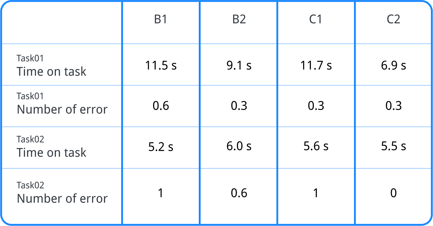
I also gathered feedback from usability testing:

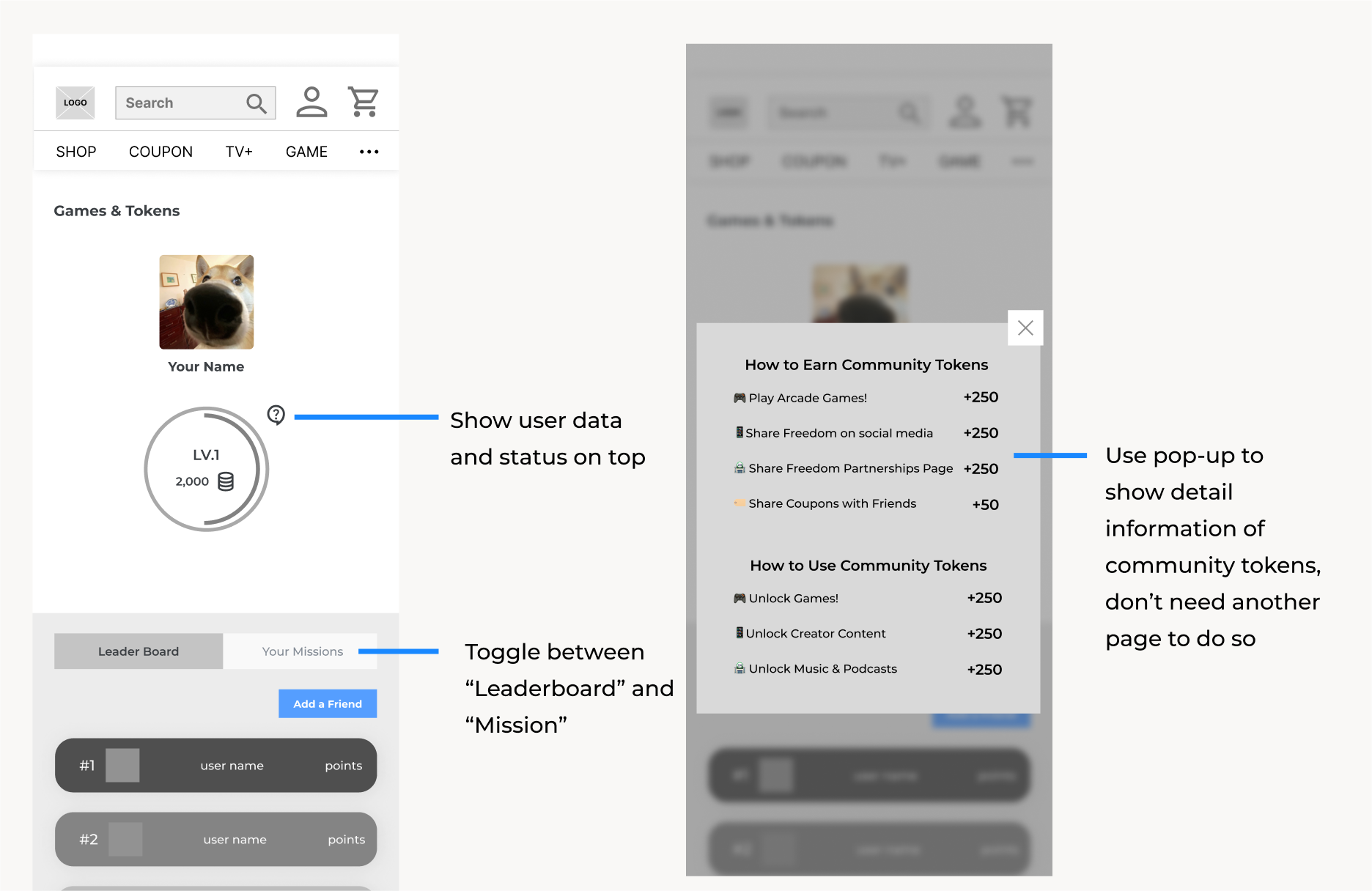
  • "I am used to seeing my own status first."
  • "I don't know how to use tokens in this page."
  • "For concept 2 I think there are too many tabs to choose from."

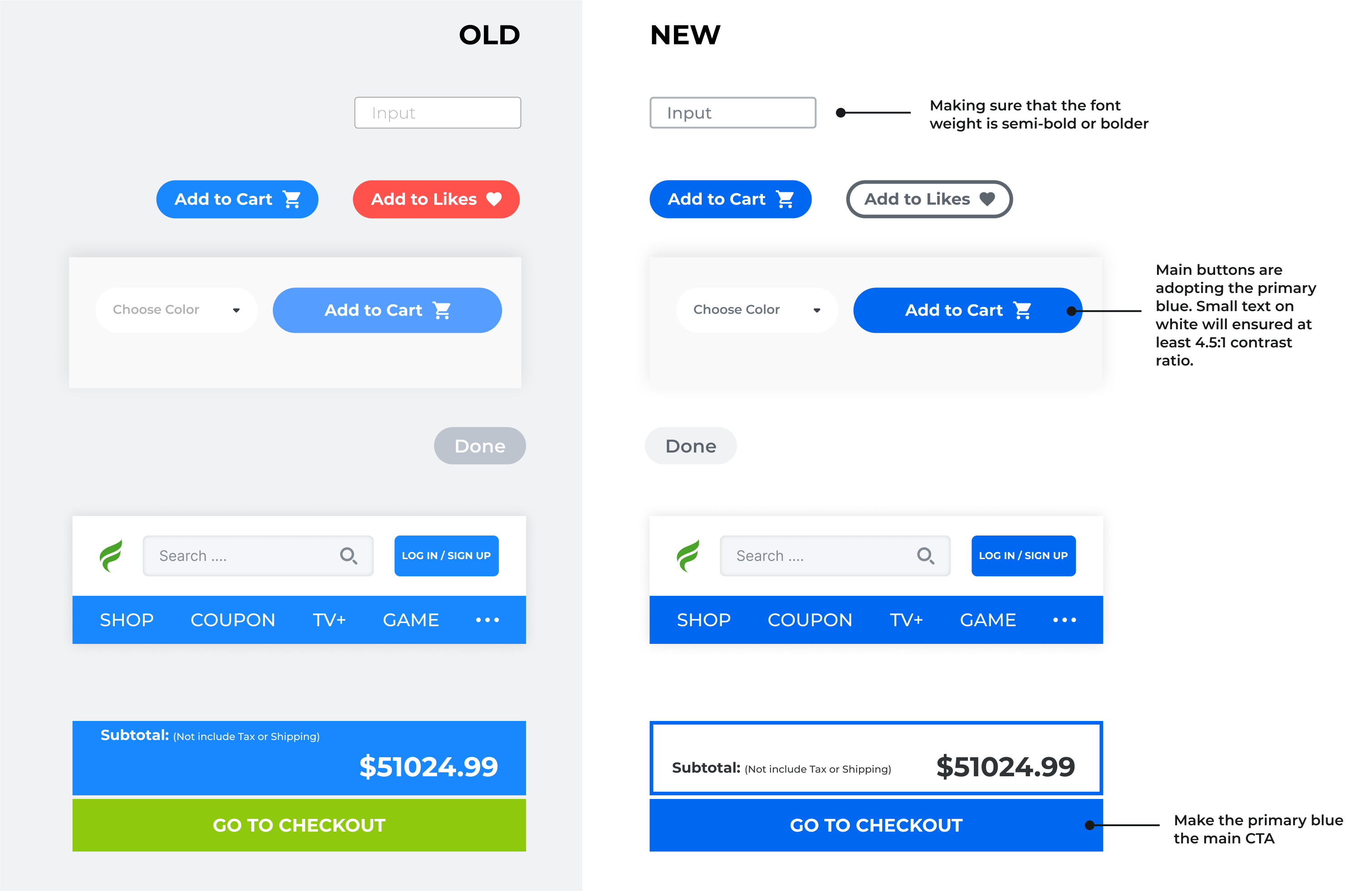
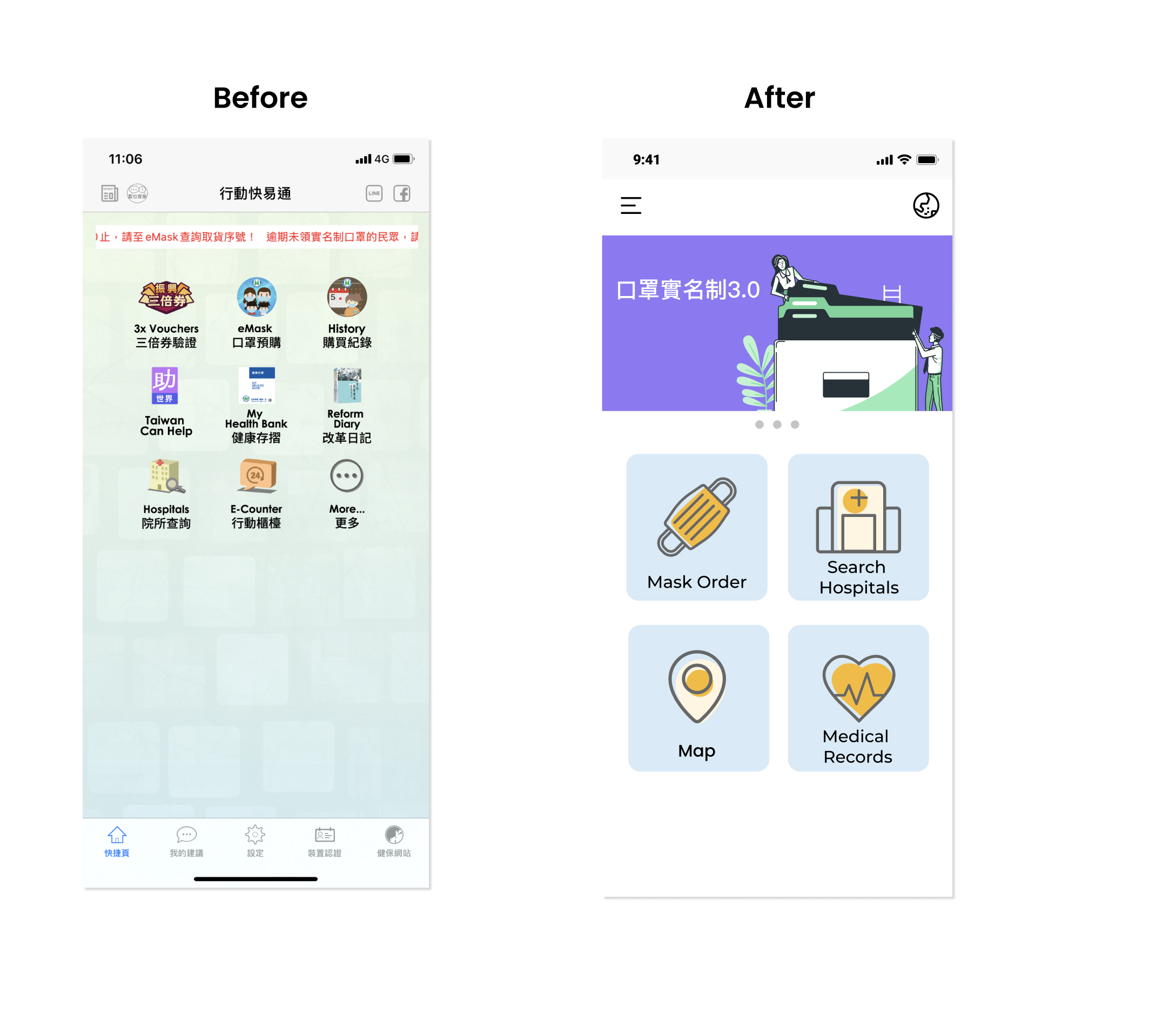
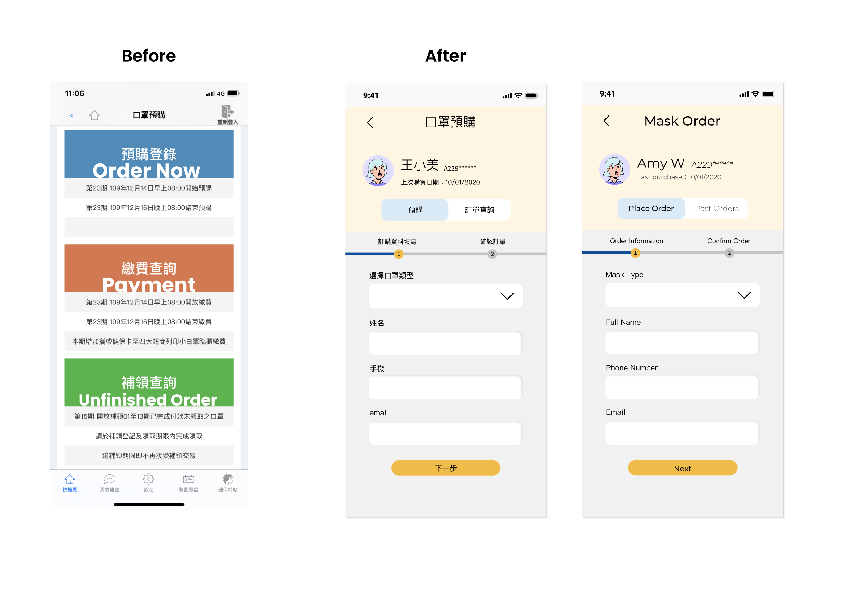
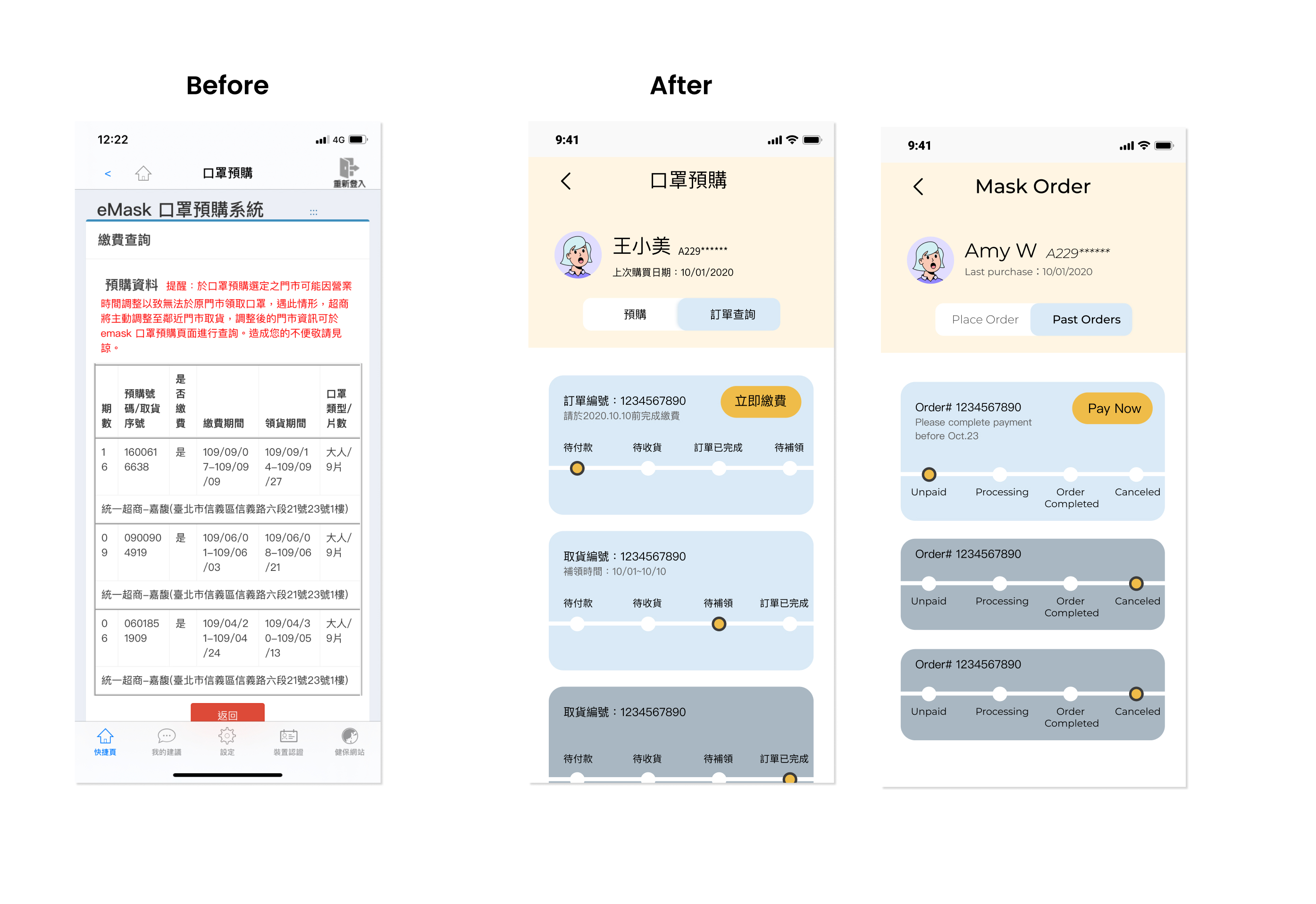
Based on the feedback and testing results, wayfinding experience is a crucial factor to providing a good UX. In order to achieve the goal we've set, I made the page less complicated and also consider technical constraints.

Walkthrough of the big changes

But wait...let's talk about colors🎨

The problem with current colors

Now that the design team handed off the designs I got time to dig deeper on the colors. The current colors are providing insufficient contrast between foreground and background.

When I audited color usage on the website, I discovered that most of the default text colors and we were using did not meet the WACG contrast threshold.

I then tried to darken the colors by 20%, but here's the horrifying result I got:

 I refuse believe we have to choose between accessibility and pretty, there must be another solution...

After research, I learned that material design uses luminance rather than hue to create an accessible color palette. I created a tonal palette and examine color contrast.

New Color Proposal

Fortunately, all of the colors passes the WCAG 2.0 compliance now!

The Solution (for now)

While color contrast is crucial for accessibility and needs to be resolved, we decided to focus on improving the navigation bar and main button colors.